Nissan
From generic automotive shapes to branded silhouettes.
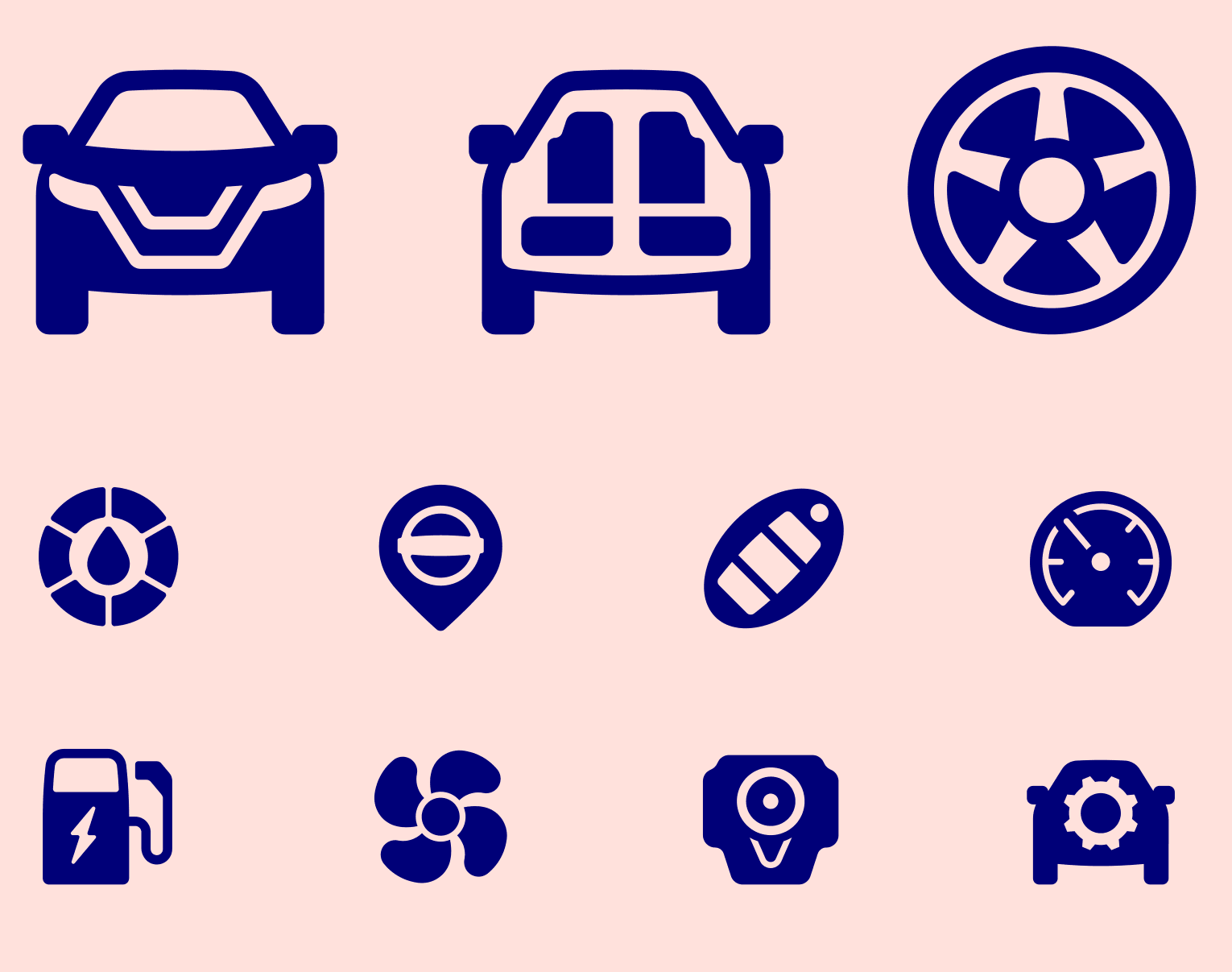
Originally planned as an evolution of an existing icon style, this project became something more fundamental: a rethinking of what modern automotive iconography could be.
Out went the generic depictions of tools, cogs and technical shorthand. In came recognisable, human-centred forms drawn from the experience itself.
Every detail was pulled closer to the brand. The vehicle silhouettes, steering wheels, key fobs and interiors were all crafted to represent their real-world counterparts.
‘Service Appointments’ shifted from tool-based shapes to a mechanic with a clipboard. ‘Four Wheel Drive’ shifted focus from abstract transmission to identifiable terrain.
The result is a bolder, more inclusive iconography suite. Less masculine and mechanical. More accessible, understandable and rooted in the products themselves.
Icons that don’t just point to products, but feel made from the same thinking.