Lixil GROHE
From complex symbols to intelligent systems.
I partnered with LIXIL Global Design to support the launch of the GROHE Aqua Intelligence® icon system. The LIXIL team had audited the existing icon sets, identifying significant inconsistencies and visual complexity, and had defined the broader project need: to develop a cohesive icon suite that could translate advanced water technologies into a compelling visual language.
Working in close collaboration, we tackled a project that quickly became much bigger than icon design. Our goal was to present a curated selection of proprietary, industry-leading innovations with a consumer-first mindset.
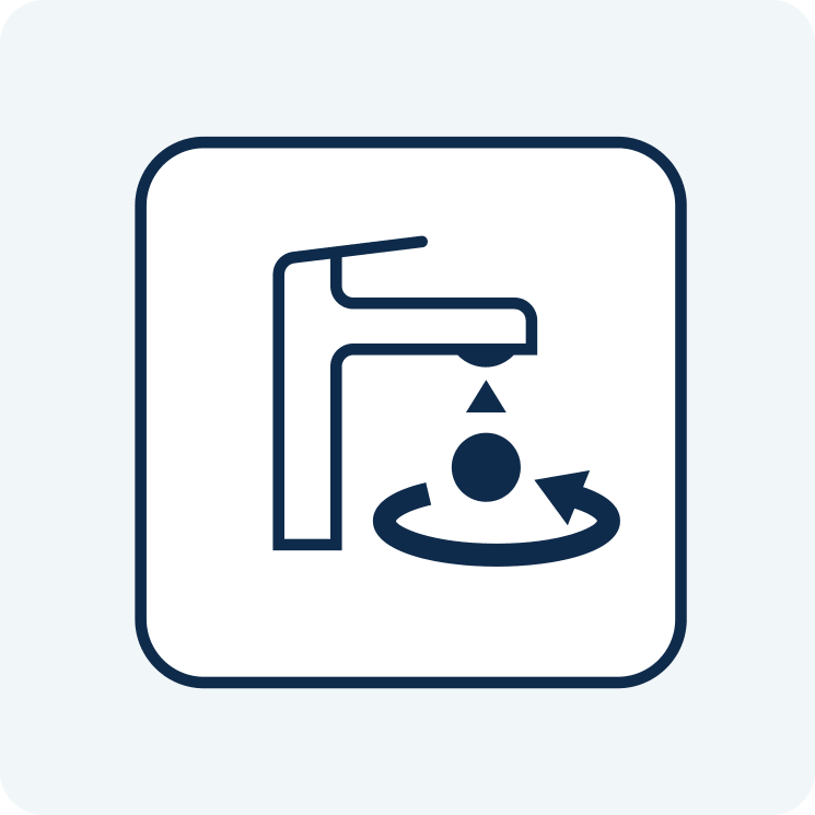
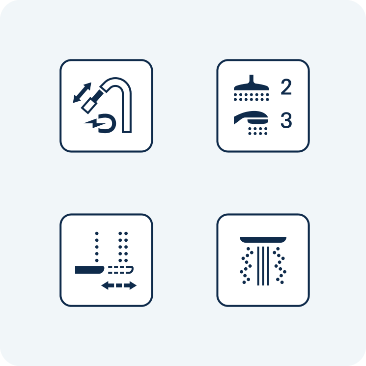
The existing symbols tried to do too much. Detailed illustrations, tiny embedded labels, low contrast and dark circular tiles failed at small scales across multiple touchpoints. Because the system needed to work extensively across digital and physical materials, it required an entirely new approach and clearer visual standards for GROHE’s iconography. The project grew beyond the GROHE Aqua Intelligence® icon system to include all 275+ Feature icons, requiring a systematic and differentiated approach.
One of the first design decisions was to clearly define metaphors, line weights and internal dimensions, giving all elements the space to breathe. Depictions were reduced to their clearest forms, built to work from a distance as well as when held in hand. The palette was then rebuilt to meet AAA accessibility standards. Aqua Intelligence received a prominent treatment, while Technical Specifications became cleaner and more functional.
The biggest shift was structural. By removing text labels from the artwork and handling them externally, we reduced variant assets by 87.5%. A custom CMS then turned a single base library into four themed visual styles, allowing teams to upload CSV files, add labels and export multiple translations. This created a globally accessible portal to support timely asset delivery and maintain global consistency.
Less artwork. More intelligence. A system designed not only to look better, but to work harder for GROHE’s consumers and internal teams.